In illustration and design, it is important to make your message as legible as possible, whether it is through text or image. First, an example:
Although this anti-smoking advert is not in English, the message can still be easily understood by those who don't speak Czech - when a nursing mother smokes, the dangerous toxins will be passed onto the child. The image is hard-hitting and controversial, but it is a very good example of a legible advert through image.The text itself is bold, and although it is small, the heading in the yellow banner draws one's attention.
This is another anti-smoking advertisement from the Department of Health, one that drew a lot of controversy in the UK over its disturbing image. The image itself, if the text was removed, would not be very legible on its own. The supporting text and the slogan 'Get unhooked' is what makes this advert so effective. The text itself is white on a dark background, which is easy to read, and is limited to a few words (which is easier for any viewers to remember and take in). In comparison, the Czech advert is quite 'wordy'.
Secondly, do text and fonts have a tone of voice?
Here, a simple phrase "Hey, you!" is reproduced in a number of different fonts. Each font lends a 'voice' to the phrase, and affects how we read it in our head. The big, bold, capitalised statements are read in a loud, commanding shout, while the lowercase and more cursive fonts are seen as friendlier and soft-spoken. The voice provided by fonts and texts are very important to the illustrator or graphic designer, as it can lend itself to the feel of the entire piece as well as appeal to a certain audience.
For example, this piece shows vibrance, the choice of colours making it a very legible image (especially the use of red text in 'live' of Alive). The words are all portrayed with boldness and energy to match the design and colour palette, and is a good example of showcasing tone of voice in fonts and legibility.
This screengrab of the Times website also has a tone of voice in its text, although a very different one. Leaning away from energy and dynamic fonts, The Times's choice in text presentation and layout portray a very simple, no-nonsense business-like approach with good legibility to match its audience (mainly adults, easier to read for those on the go and browsing using their phone, or only having five minutes in a lunch break - those in more of a rush will not want to take time out to navigate around a difficult-to-read site). In contrast, the CBBC site for Newsround is designed specifically to appeal to kids - bright colours, more interesting fonts to hold their attention.
Images used:
http://lh5.ggpht.com/ash88leigh/RwvEYsJTj9I/AAAAAAAAAFE/pU1LXCupHLw/untitled5%5B1%5D.png
http://static.guim.co.uk/sys-images/Media/Pix/pictures/2007/05/15/smokead128.jpg
http://www.kumailht.com/blog/wp-content/uploads/2009/03/typography.png
http://image.guardian.co.uk/sys-images/Arts/Arts_/Pictures/2008/04/30/fishhook460.jpg
Articles used:
http://www.guardian.co.uk/media/2007/may/16/advertising.uknews
http://www.dailymail.co.uk/news/article-455106/Anti-smoking-advert-frightening.html
http://www.thetimes.co.uk/tto/news/ <i>[screencap taken 25/10/2010]</i>
Monday, 25 October 2010
Sunday, 10 October 2010
The Importance of Research and Experimentation in Visual Communication
Research, from reading books or the newspaper to using your eyes and ears in the outside world, is essential to any artist, not just illustrators, although illustration will be focussed upon in this blog post. It deepens one's understanding of the subject assigned, and if the illustration is a successful one, it will at least make a contribution to the reader's understanding.
For example, a caricaturist spends much of his or her time studying human anatomy and how the muscles, bones and joints are structured in order to be able to exaggerate them effectively. An illustrator for young children would study popular picture books, animated TV shows and toys, and maybe even ask a classroom of children about what they think and what holds their interest. A cartoonist who works with newspapers will keep up to date with current affairs and populat figures of the day, and if their art is particularly political they may research further into satire. When an illustrator specialises into a certain area (if at all), research is still very much needed, and there are many sources to draw inspiration from.
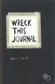
An artist will also collect things that they find of interest regardless of whether it relates to the subject they work in, and it will become research in the form of expanding one's 'visual vocabulary'. This includes rubbings of fascinating textures, saving old train tickets, taking photographs, postcards of another artist's work that they feel inspired by, trying out an unusual media or technique - experimentation is extremely important to the development of an artist and a particular style. Illustration is very diverse and adaptable, and it's very easy to not only be confused about your own style, but to be 'stuck in a rut'. Pictured above is Wreck This Journal, by Keri Smith, a book in which wacky experimentation, making a huge mess and completely letting go is the whole point. It helps one to find techniques they like, or even may inspire a drawing style. Pictured below is Smith's introduction to the journal, which sums up the topic nicely:
Images used:
http://28.media.tumblr.com/tumblr_kowhv8J3aq1qz76g8o1_500.jpg
http://photo.goodreads.com/books/1174674083l/428862.jpg
Subscribe to:
Comments (Atom)


